I. WordPress Multilingual Website Font Setting Tutorial: Best Practices
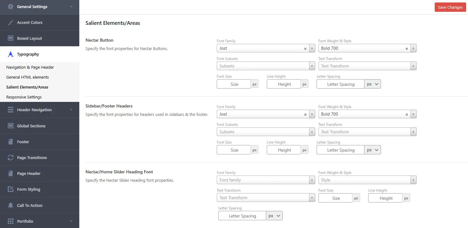
When designing a multilingual website (e.g., supporting English, Traditional Chinese, and Japanese), font setting can feel overwhelming for beginners. Fonts impact not only the website’s aesthetics but also its readability and performance. Below are two common approaches to font settings, along with practical suggestions to help make optimal choices.
II. Font Settings for Single-Language Websites
Traditional Chinese Webpage Font Setting CSS Demo
/* Traditional Chinese Webpage Font Setting CSS */
body {
    font-family:
        "Noto Sans TC",
        "Source Han Sans TC",
        "PingFang TC",
        "Microsoft JhengHei",
        sans-serif;
}
This applies the font across the entire site. However, when a website becomes multilingual, such a global setting may lack flexibility, as other languages (e.g., English or Japanese) might not pair well with these fonts.
III. Adjustments After Making a WordPress Site Multilingual
Take the WP Misuzu website (https://wpmisuzu.com) as an example—it supports English, Traditional Chinese, and Japanese. When using popular WordPress translation plugins (e.g., Polylang or WPML) and enabling additional languages, the CSS :lang() pseudo-class activates based on language tags. For instance, :lang(zh) applies to Chinese pages.
In a multilingual website, fonts should be tailored to each language to ensure the best fit. On wpmisuzu.com, the setup looks like this:
Traditional Chinese, Japanese, English Multilingual Webpage Font Setting CSS Demo
/* zh, ja, en Multilingual Webpage Font Setting CSS */
:lang(zh) {
    font-family:
        "Noto Sans TC",
        "Source Han Sans TC",
        "PingFang TC",
        "Microsoft JhengHei",
        sans-serif;
}

:lang(ja) {
    font-family:
        "IBM Plex Sans JP",
        "Hiragino Kaku Gothic Pro",
        "Meiryo",
        "Noto Sans JP",
        sans-serif;
}
- Traditional Chinese (zh): Uses fonts designed specifically for Chinese.
- Japanese (ja): Uses fonts optimized for Japanese.
- English (en): It’s generally unnecessary to use :lang(en)—English can inherit the default font from the theme or plugin.
IV. Why Skip CSS Settings for English :lang(en)?
English default fonts are typically inherited from the theme or plugin: Most WordPress themes or plugins already define suitable fonts for English, such as Arial or Roboto. These themes often load font files from Google Fonts or a local server. Since English font files are small (usually 0.1–2 MB), forcing a download has minimal impact on user experience.
Performance challenges with Chinese and Japanese fonts: The situation differs for Chinese or Japanese fonts. For example, fonts like “Noto Sans TC” (Traditional Chinese) or “Noto Sans JP” (Japanese) range from 10–30 MB—10 to 100 times larger than English fonts. Forcing visitors to download these large files can slow down the site, especially on weaker network connections, potentially harming user experience.
V. Two Approaches to Font Settings
1. Avoid Forcing Chinese/Japanese Font Downloads
Traditional Chinese, Japanese, English Multilingual Webpage Font Setting CSS Demo:
Traditional Chinese, Japanese, English Multilingual Webpage Font Setting CSS Demo
/* zh, ja, en Multilingual Webpage Font Setting CSS */
:lang(zh) {
    font-family:
        "Noto Sans TC",
        "Source Han Sans TC",
        "PingFang TC",
        "Microsoft JhengHei",
        sans-serif;
}

:lang(ja) {
    font-family:
        "IBM Plex Sans JP",
        "Hiragino Kaku Gothic Pro",
        "Meiryo",
        "Noto Sans JP",
        sans-serif;
}
How it works?
- The system checks the visitor’s device for fonts in the listed order:
- If “Noto Sans TC” is available, it’s used.
- If not, it tries the next option (e.g., “Source Han Sans TC”), and so on.
- The final sans-serif serves as a fallback, using the device’s default sans-serif font if none of the specified fonts are found, ensuring text remains legible.
Advantages: No added loading burden, ideal for performance-focused sites.
Disadvantages: Display consistency may vary depending on the visitor’s device.
2. Force Download from Google Fonts
Force Google Fonts Download with Multilingual Setting CSS Demo
/* Force Google Fonts Download with Multilingual Setting CSS */
@import url('https://fonts.googleapis.com/css2?family=Noto+Sans+TC:wght@400;700&family=IBM+Plex+Sans+JP:wght@400;700&display=swap');

:lang(zh) {
    font-family: "Noto Sans TC", sans-serif;
}

:lang(ja) {
    font-family: "IBM Plex Sans JP", sans-serif;
}
How it works?
1. Google Fonts Import:
The @import rule loads two fonts from Google Fonts:
- “Noto Sans TC” for Traditional Chinese (:lang(zh)).
- “IBM Plex Sans JP” for Japanese (:lang(ja)).
wght@400;700 specifies weights 400 (normal) and 700 (bold), while display=swap ensures font loading doesn’t block page rendering.
2. Language Tag Activation:
- When the page’s HTML is tagged as <html lang=”zh”> (or zh_TW), :lang(zh) triggers, and the browser downloads and applies “Noto Sans TC.”
- When tagged as <html lang=”ja”>, :lang(ja) triggers, applying “IBM Plex Sans JP.”
3. Fallback Mechanism:
- If Google Fonts fails to load (e.g., due to network issues), the system falls back to sans-serif (the visitor’s default sans-serif font), ensuring text remains visible.
Notes
Since font downloading from Google Fonts has been mandated, it is sufficient to configure just one font.
VI. Summary: Personal Suggestions
-
- English with Theme Defaults: Inherited from the theme or plugin, no need to specifically set it with CSS.
- Chinese/Japanese Options:
- For performance priority, use the first method—avoid forcing Chinese/Japanese font downloads.
- For consistency, use the second method—force downloads from Google Fonts, but limit to essential weights (e.g., 400 and 700) to avoid overloading with unnecessary data.
- Always Include Fallback Fonts: Add sans-serif or serif at the end of font-family to guarantee text display.
- Test Performance: Use browser developer tools to check loading times and balance aesthetics with speed.
The first method, prioritizing performance, tends to be the preferred approach.
Flexible Adjustments
There’s no need to stick strictly to the fonts mentioned here. For example, “Noto Sans TC” can be swapped for “Source Han Sans TC” or other preferences—adjustments can be made based on specific needs.


