I. Best Free Fonts : Jost Font – A digital font that combines historical charm with modern geometric beauty
Jost is a modern sans-serif typeface designed by Indestructible Type, drawing inspiration from the iconic 1920s typeface Futura, created by Paul Renner. It preserves Futura’s geometric elegance and rational spirit while being optimized for the digital era, making it a popular choice for web, branding, and print design. Jost is celebrated for its free, open-source availability under the SIL Open Font License, offering nine weights (from Hairline to Black) and variable font technology, earning it favor among designers worldwide.
II. Font display
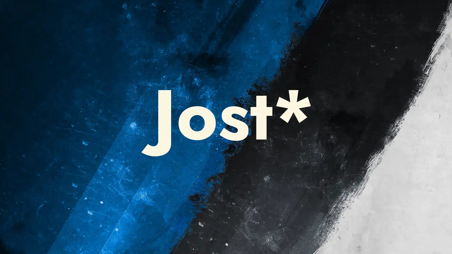
Jost Font Preview
Ideas shape tomorrow.
A B C D E F G H I J K L M N O P Q R S T U V W X Y Z
a b c d e f g h i j k l m n o p q r s t u v w x y z
1 2 3 4 5 6 7 8 9 0 , . ! ? ; : ' " ( ) - /
III. History and Background
Created by Owen Earl in 2017, Jost was initially named Renner as a tribute to Futura’s designer, Paul Renner. Due to copyright concerns, it was later renamed Jost to honor Heinrich Jost, a key figure in Futura’s development. Rather than being a mere replica of Futura, Jost incorporates modern refinements, such as a larger x-height and more balanced uppercase proportions.
IV. Design Characteristics
Jost blends the geometric precision of German sans-serif typefaces with the readability of British humanist typefaces. Its notably “tall” lowercase letters are particularly striking. Other features include:
- Clean Lines: Minimalist style with no superfluous ornamentation.
- Varied Weights: Nine weights (Hairline to Black), each with italics, totaling 18 styles.
- Variable Font: Supports dynamic adjustments to weight and slant, ideal for modern web needs.
- High Legibility: Larger x-height and uniform strokes enhance clarity in small text sizes.
- Language Support: Covers over 50 languages, including Latin, Cyrillic, ligatures, and mathematical symbols.
Compared to Futura, Jost has more modern proportions and lower contrast, making it especially suitable for digital displays.
V. Web Applications
Jost is freely available on Google Fonts and excels in website headings (H1-H6) and navigation menus, enhancing visual appeal and professionalism. While it can be used for body text, its decorative nature may reduce readability in long passages, requiring careful pairing.
Many websites, including the English pages of WP Misuzu, select Jost for headings and menus to achieve a clean, modern aesthetic.
Implementation:
- WordPress sites can configure Jost via themes or plugins.
- Non-WordPress sites can include the following code: [Code placeholder as per original text].
/* Including 400-700 weight */
@import url('https://fonts.googleapis.com/css2?family=Jost:wght@400;500;600;700&display=swap');
body { font-family: 'Jost', sans-serif !important; }
VI. Body Text Pairings
Jost is a distinctive, decorative typeface ideal for headings (H1 to H6) and website menus, instantly lending designs a stylish and layered look. Its geometric lines and unique character create a striking visual impact, perfect for adding flair to pages. However, for body text, Jost’s readability may feel strained, potentially causing fatigue during extended reading. Pairing it with a suitable body font is therefore crucial. Below are six excellent body font recommendations that complement Jost seamlessly:
Lexend
Used for body text on the WP Misuzu website, Lexend was chosen for its design focused on enhancing readability. This sans-serif typeface features open letterforms and carefully tuned spacing, ideal for long-form content. Inspired by improving reading fluency and reducing visual fatigue, Lexend exudes a charming, delicate aesthetic.
Lexend Font Preview
Words spark clarity.
A B C D E F G H I J K L M N O P Q R S T U V W X Y Z
a b c d e f g h i j k l m n o p q r s t u v w x y z
1 2 3 4 5 6 7 8 9 0 , . ! ? ; : ' " ( ) - /
Manrope
Manrope is a modern sans-serif typeface blending soft geometric curves with clean lines, offering a balanced mix of aesthetics and functionality. Its versatility suits body text, headings, and UI elements, particularly in designs aiming for modernity and approachability. With a wide range of weights, Manrope adapts effortlessly to various contexts, ensuring clarity and engagement.
Manrope Font Preview
Design shapes our world.
A B C D E F G H I J K L M N O P Q R S T U V W X Y Z
a b c d e f g h i j k l m n o p q r s t u v w x y z
1 2 3 4 5 6 7 8 9 0 , . ! ? ; : ' " ( ) - /
Inter
Inter is a highly legible sans-serif typeface crafted for digital interfaces, with a neutral yet characterful appearance. Its optimized proportions make it perfect for body text, buttons, or content-heavy pages. Inter’s flexibility and extensive language support make it a top choice for creating clean, professional content, from small blogs to corporate websites.
Inter Font Preview
The quick fox jumps.
A B C D E F G H I J K L M N O P Q R S T U V W X Y Z
a b c d e f g h i j k l m n o p q r s t u v w x y z
1 2 3 4 5 6 7 8 9 0 , . ! ? ; : ' " ( ) - /
Roboto
Developed by Google, Roboto is a classic sans-serif typeface renowned for its modernity and versatility. It strikes a perfect balance between mechanical structure and humanized details, offering comfortable and lively reading. Ideal for body text, app interfaces, or branding, Roboto suits scenarios needing professionalism and warmth, with diverse weights adding flexibility.
Roboto Font Preview
Build a bright future.
A B C D E F G H I J K L M N O P Q R S T U V W X Y Z
a b c d e f g h i j k l m n o p q r s t u v w x y z
1 2 3 4 5 6 7 8 9 0 , . ! ? ; : ' " ( ) - /
Poppins
Poppins is a geometric sans-serif typeface with rounded letterforms and a vibrant personality. Combining style and readability, it works well for body text, headings, or brand identities, especially in youthful, dynamic web designs. Its multiple weights enable versatile pairings, creating modern and friendly content displays.
Poppins Font Preview
Explore new horizons.
A B C D E F G H I J K L M N O P Q R S T U V W X Y Z
a b c d e f g h i j k l m n o p q r s t u v w x y z
1 2 3 4 5 6 7 8 9 0 , . ! ? ; : ' " ( ) - /
Lora
Lora is an elegant serif typeface with calligraphic-inspired strokes, modern yet refined. It excels in body text for content requiring a literary or narrative tone, such as blog posts or publications. Lora’s warm, clear forms enhance reading immersion, ideal for designs seeking a touch of sophistication.
Lora Font Preview
Stories weave dreams.
A B C D E F G H I J K L M N O P Q R S T U V W X Y Z
a b c d e f g h i j k l m n o p q r s t u v w x y z
1 2 3 4 5 6 7 8 9 0 , . ! ? ; : ' " ( ) - /
VII. Conclusion
Jost is a sans-serif typeface that masterfully blends classic and contemporary elements. Inspired by Futura, it has been innovated to meet the demands of the digital age. Whether in branding, web development, or print typography, Jost captivates with its striking presence.